COVID-19 Data Exploration in R
- Dana Daher

- Apr 17, 2020
- 4 min read
Updated: Feb 26, 2021

For this exercise, I have used data from this kaggle source and used the CSV data set “covid19_line_list_data”. This is a dataset with 1085 observances and 28 variables. This is a subset of the COVID-19 data where variables like age, gender and qualitative summaries of cases are available. As the intention of this exercise was to explore the data, this source was useful. However, it should by no means act as a representation of the incidence rates for COVID-19 today.
#packages used for this exercise
r = getOption("repos")
r["CRAN"] = "http://cran.us.r-project.org"
options(repos = r) install.packages("readr") install.packages("ggplot2")
install.packages("gridExtra")
install.packages("tidyverse")
install.packages("ggridges")
library("ggridges")
library("ggplot2")
library("tidyverse")
library("gridExtra")
library("readr") dataset <- read_csv("~/Desktop/COVID19_line_list_data.csv")
The death column currently has several distinct values. The values should be a 0 (meaning no death), or 1 (meaning death). The additional distinct values are the date of a patient's death. Instead of re-writing the data, I have opted to add a new column for the variables within the dataset.
dataset$death_d <- as.integer(dataset$death != 0)Now that we have cleaned the death incidence accounts, we can calculate the death rate. This is the number of deaths over the total number of reported cases. Additionally, we want to subset the data for additional inquiry.
sum(dataset$death_d) / nrow(dataset)
# We will also subset the death incidence rates dead = subset(dataset, death_d == 1)
alive = subset(dataset, death_d == 0)
Using the dataset, let’s test the hypothesis that older people are more likely to die from COVID-19 than younger patients. Here, we can run a two-sample t-test to validate our hypothesis with a 95% confidence interval.
#We can derive the mean age of those that diemean(dead$age, na.rm = TRUE) #We can now run a t.test for the ages of those alive and those who die t.test(dead$age, alive$age, alternative="two.sided", conf.level = 0.95) #If the p-value is is less han 0.05, we can reject the null hypothesis.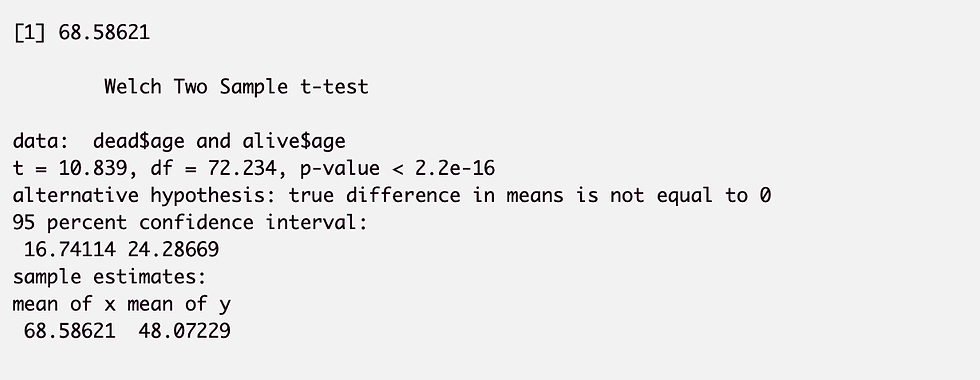
Here, the p-value is indeed lower than 0.05, and we can reasonably reject the null hypothesis. It is thus true that older populations are more likely to die from COVID-19.
We will now perform a similar exercise for gender. Here, we will subset the data by gender, check the mean age of each gender subset and test the hypothesis that men are more likely than women to die from COVID-19.
male = subset(dataset, gender == "male")
female = subset(dataset, gender == "female")
mean(male$death_d, na.rm = TRUE)
mean(female$death_d, na.rm = TRUE) ##Again, we can test the hypothesis that men are more likely to die than females from covid-19 t.test(male$death_d, women$death_d, alternative="two.sided", conf.level = 0.95)
As the p-value is 1.282e-11, less than 0.05, we can reject the null hypothesis and confirm that men are more likely than women to from COVID-19.
Let’s now plot the age distribution of females and males infected with COVID-19 with a bar plot.
fp <- ggplot(female, aes (x = age)) +
 geom_bar(fill = "purple") +
 labs(title = "female age distribution covid-19") mp <- ggplot(male, aes (x = age)) + geom_bar(fill ="blue") + labs(title = "Male age distribution covid-19")
grid.arrange(fp, mp, nrow = 1, ncol =2)
Alternatively, we can also show this data through a density ridge. It must be noted that this data set has several NA values in gender. For this exercise, we will omit these values.
ggplot(data = subset(dataset, !is.na(gender)), aes(x = age, y = gender)) +
geom_density_ridges(color = "yellow", fill = "lightblue")+
theme_ridges(font_size = 10, grid = TRUE) +
labs(title = "Covid-19 Infection by Gender and Age ") + theme(legend.position = "none")

We will now explore the age distribution of infections by country.
ggplot(dataset, aes(y = country, x = age)) +
geom_point(colour = "blue", size = 0.5) +
labs(title = "Covid-19 Infection Age by Country ")

We can also subset the data based on each country of interest. For this example, I will subset the data for South Korea and perform a similar analysis to the ones performed above on infection by population age distribution and gender.
plotdata <- dataset %>% filter(country == "South Korea")  ggplot(plotdata, aes(y = gender, x = age)) +     geom_density_ridges(color = "red", fill = "lightblue") + theme_ridges() +
labs(title = "South Korea - Covid-19 Infection by Age and Gender ")+
theme(legend.position = "none")
We can also plot the charts through violin plots which are similar to box plots, except they also show the kernel probability density.
ggplot(data = subset(dataset, !is.na(gender)), aes(x = gender, y = age)) +
 geom_violin(fill = "cornflowerblue") +
 geom_boxplot(width = .2, fill = "plum1", outlier.color = "", outlier.size = 2) +
 labs(title = "Age Distribution of Covid -19 Infection by Age")
Finally, we will look at death rates relative to only gender and age. As the death rate of this data set is about 5.8%, the number of observances are relatively low.
ggplot(data = subset(dead, !is.na(gender)), aes(x = gender, y = age)) +
 geom_violin(fill = "lightblue") +
 geom_boxplot(width = .2, fill = "blue", outlier.color = "", outlier.size = 2) +
 labs(title = "Covid-19 Confirmed Deaths Age Distribution of Covid -19 by Gender")
This was a quick exercise in exploring COVID-19 data. It is once again not a representation of the current incidence rates for COVID-19.


Comments